Thursday, December 1, 2011

Book Cover

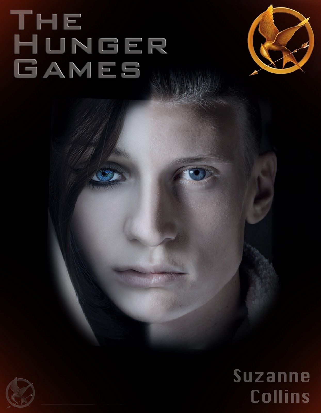
I chose to create a cover for "The Hunger Games" a book I haven't read. The main characters are a boy and a girl so I combined their faces. The girl has a symbol (the bird and arrow) which I put in the corners. There is a lot of fighting in this book so I pt a black background because it seemed dark. I also added a little bit of read because children fight to the death in this book and it suggests blood. 

Tuesday, November 22, 2011

Cat in the Hat


"Cat in the Hat" was my favorite Dr. Seuss  book. I drew this picture of him in Illustrator and added the blue background in Photoshop.

Thursday, November 17, 2011

Life Magazine's Best and Worst

 
I think this is Life's best cover because design is clear and concise. The words are placed where they're easy to read and the image catches your eye.


I think this one is the worst cover because it looks like the image is very distorted. The boy's feet are streched out and oddly think and the pumpkin appears somewhat skewed.

Friday, June 3, 2011

Avatar & Cartoon


The first image I made Alicia a Na'vi by giving her blue skin, blue stripes and added a texture to it. I made her eyes huge and gave her luscious eyelashes. The second one I took an image from outside and cartooned myself in Illustrator with the blob brush. Finally, I added a "poster edges" effect from photoshop to the picture.

Sunday, May 29, 2011

Business Card


I illustrated an image of polaroid pictures scattered over a table top with a design engraved in the wood. And finally with my name and contact info on a piece of paper that was ripped out. The 15 Green things picture is also paper clipped to the paper and the other image in thumb tacked to the table.

Thursday, May 26, 2011

Cinematic Gif Experiment

http://flowerstar3.deviantart.com/art/Cinematic-Gif-Experiment-210388328
I created an animated gif of the girl from the Memory Project in Africa. I had to upload it on DeviantArt first because blogger would not let the gif run even when you clicked on it. Go to the link above to see it and click on the image once you're there to watch the animation.

Cinematic Gif Experiment

Friday, May 20, 2011

Memory Project

I took Solange's image and gave her African earrings. I looked up some pictures on Rwandan women and saw they wear a headdress of cloth wrapped around their head and decided to put one on her. I then added Solange to an African plain for the background.

Monday, May 16, 2011

Rainbow Cut Outs

I took pictures of all four of our eyes. I used the custom shape tool to make the star cut out and a layer mask with that. I put a rainbow gradient over the eyes on overlay, then I used the gradient again on the top lay but inverted the colors.

Monday, May 9, 2011

Pamela Wilson

Pamela Wilson does her art in a realism style. This painting is called "Some Bullets Are Special" on oil linen. She does a lot of people in her paintings with dramatic makeup.

Christina Aguilera Inspired

Instead of making Alicia robotic I went with a nature theme. I made her nose a mushroom upside down. For her lips I took two pink petals and warped them into shape. I overlayed bark on her face. I added a little hole at the top to make it more like like a tree, with a little caterpillar coming out of it.

Wednesday, April 27, 2011

Monet Style

I used a large combo of Filter Gallery effects and change of blending modes. I applied filter gallery effects to the whole thing, then used a layer mask to make sure they were only on me or the wall. For the last part I copied merged and used a lens blur to make it more soft and turned the opacity down.

Tuesday, April 26, 2011

Live Eggs

I took six of Alicia's silly faces and put them on an image of eggs. I made each face a group to keep it more organized and easier to work around. For each face I mostly used a layer mask, match color, different blending modes and colors. I used the clone tool a lot to blend the human skin and the egg text together. I used a clipping mask and the dodge/burn tool for shadows.

Wednesday, April 20, 2011

Panarama

I took three images of the junior parking lot on a nice sunny day. Then I uploaded them into File > Automate > Photomerge. I chose the "auto" one so that it would figure out how to place them itself. I cropped the finale image so that there were no white spaces.

Wednesday, April 13, 2011

Chairs


For the top chair I used strips of various famous artist's paintings then used the burn and tool to make it more 3D.  The second chair has Van Gogh paintings on it, with the original seat cushion showing. The third I used Seurat paintings. Since it was already a solid color with shadows/highlights, I just desaturated it and put the blend mode to overlay.

Wednesday, March 30, 2011

Midterm

I took an picture I had made before of a car driving in the mountains and an eclipse. I put my name with the type tool and added the shapes with the custom type tool. The rest of the squares I used various filters and adjustment layers.

Tuesday, March 29, 2011

Kaleidoscope Effect


I took a picture of the key pad on the vending machine. I thought it would give a cool effect with all the numbers. I added a gradient map adjustment layer to it with a blue, aqua and yellow gradient with the opacity turned down to about 25%.
This image I took of the door handle to the library. To this one I added the filters in the filter gallery of ink outlines and film grain. This turned it black and white but kept some of the shine on the handle.

I took this one of a mural with fish on it. I just rotated it and added a viberance layer to it.


Tuesday, March 22, 2011

3x3 Grid

I made the boarder of roses because my middle name is Rose and they are my favorite flower. I took one larger background image and put it behind the other nine pictures. I grouped the other top layers and set the blending mode to vivid light so that you could still see some of the other image behind them. I put a hue/saturation adjustment layer on the larger image to give it a sepia effect, and a black and white layer then turned up the blue to make my eyes pop more.

Thursday, March 17, 2011

Photo505.com Effects


Photo505.com had many cool effects. You could only use face shots facing forward though. The face detection did not work very well at times either so you had to have a very precise image.

Tuesday, March 15, 2011

4 Square Filter Project

On the top left, I added the craqulure filter and changed the color balance. The top right I put a pixelate filter on it and a green gradient and changed the blending mode to hard light. Bottom left, I put distort > extrude and overlayed a purple color. On the bottom right, I added the glass filter but before that I played with the contrast a bit.


The bottom image I added different brush strokes and a texture to the top left. then changed it to difference blending mode. The top right I put a mosaic filter on it. Bottom left, I used a stylize filter and the diffuse glow. The bottom right one, I added a few textures and played with selective color adjustment layer.

Thursday, March 10, 2011

Janitor Safety

I made this flyer because people need to be aware of the chemicals and toxins they use. Many are harmful and dangerous to people and the natural world around us.

Monday, March 7, 2011

Visual Puns

For the first I used overlay with the logo over the curtains. The second I used posterize on the fist with fruit. Third, I used threshold on the tooth as a guitar pick. And finally the couch potato I used gradient map.

Wednesday, March 2, 2011

Snow Person

I started this in February because I thought it would be nice in the winter months. I just added the bench using the pen tool, magic wand and  quick select to select different parts of it. I then used the Image> Match Color took to make sure it matched the background, and the blur tool to smooth the edges. I did the same with Alicia but used many Adjustment Layers to get it just right. I turned her skin white as if to make her a type of mystical snow person.

The first image I just made on jacksonpollock.org; by moving the mouse at different speeds for thickness and clicking to make it different colors . The second one I made in CS5. I used the "paint brush" brushes for an authentic painting look and mixed different Filter Gallery filters with it. I also changed the blending mode of some and used some different brushes.

Monday, February 28, 2011

I took the silhouette of a running horse and put it under water. I created a blue type gradient to give the effect as if the sun was shining through the water. 

This is a silhouette of me. I put a lens flare over it starting at the sun for a nice effect. Over the whole silhouette I put a pattern, adding a bevel and turned down the fill.

Monday, February 14, 2011

Fairy Night


I inverted the original colors on Alicia's dress. You can't really see it, but I added a small water fall and water on the ground. To get the blue effect I played with the color balance. For the bubbles, I used the ellipse tool to select part of the image and used the spherize distortion. I also added an outer glow and a little dot for the highlight on the bubbles. 

Wednesday, February 9, 2011

15 Green Things


I created a water scene reflecting all the "15 green things" and have the hands and the apple in the water. On the little boy I added the cat image and changed the blend mode and used a layer mask to make it fit to his face. After I was happy with the arrangement and transformation of everything, I copy merged and desaturated it. Then I colored a few of the items playing with the opacity and blend change. Then I added an effect from the filter gallery and a rainbow gradient.

Monday, January 31, 2011


Given these five layers I manipulated it to have some variety. I did this with scaling, rotating and changing it to horizontal/vertical. I also changed the opacity a little on the strips and used a layer mask to erase around the people and music notes.